Introduction
I’ve always been fascinated by the world around us, and the many ways we try to understand it. There are multiple manners we can experience or describe our Planet, from the formal and rigorous methods of math and physics to the more creative art of photography and painting. In recent years, we saw a massive improvement in the technology we have at hand, in particular, algorithms and computational power. From more advanced mathematical models, quantification of inference uncertainties, and digital twins of complex systems, to new and massive missions to provide near-real time data. How can we leverage these technologies and use them to observe and assist the Planet we are living on?1
This article is the first in a series documenting my journey in exploring the Earth with modern observation techniques, where I will learn and share how we can leverage algorithms, math, and new technologies to help us better understand our environment.
Among the many applications in this field, I’ve chosen to start focusing on detecting wildfires using satellite data. The European Forest Fires Information System (EFFIS) published data highlighting how the average area affected by fires in 2025 in European Union member states was more than double the average across 2006-2024. The Mediterranean region is the one that got most impacted by this phenomenon, which has drastic effects and consequences not only on the impacted areas, but on the overall natural equilibrium, with side effects both on the society and economy. When biomass burns, a lot of components with short and long term impact on human health and the environment are released; black carbon and nitrogen oxides are just a few examples.
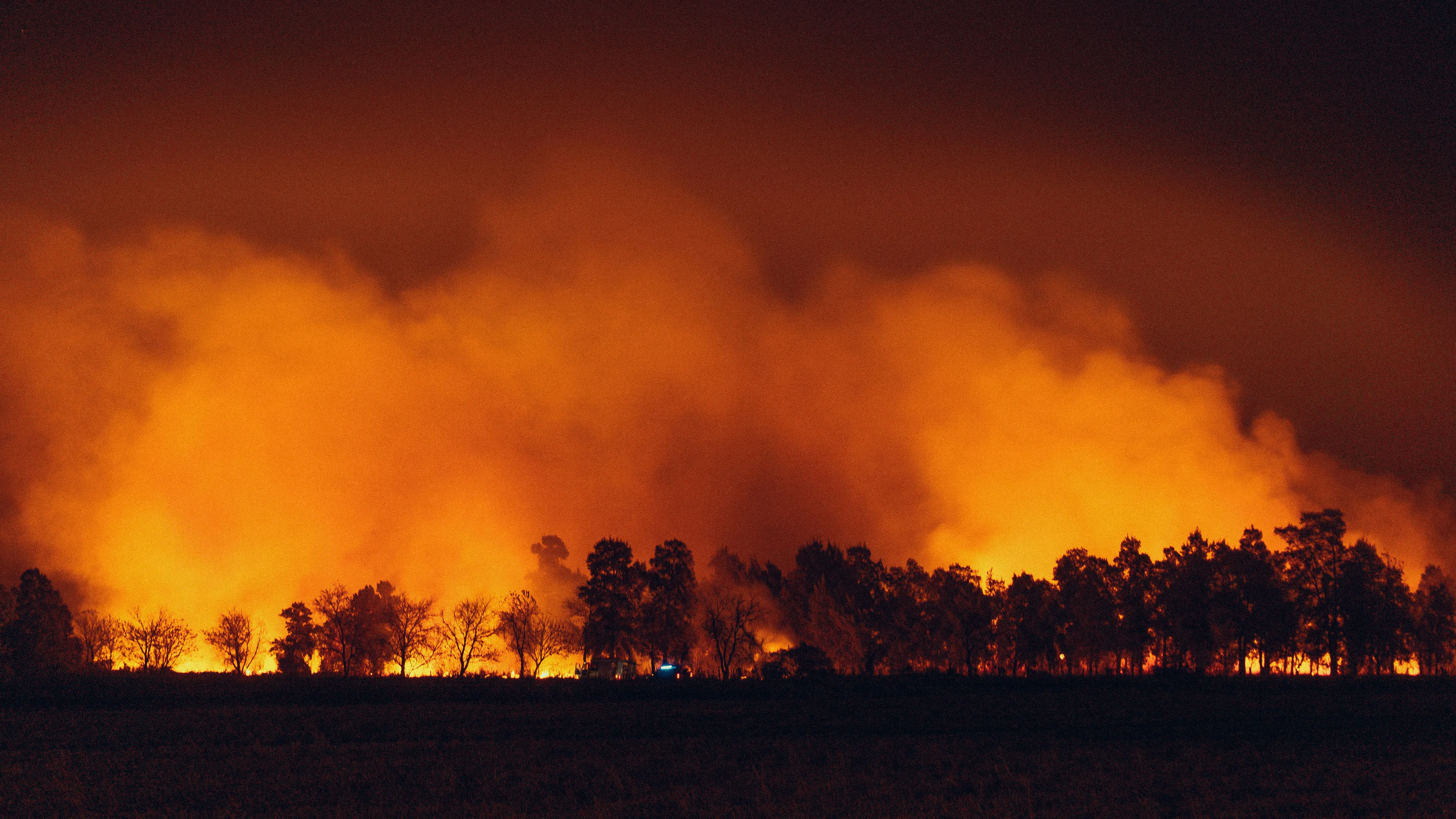
As a case study, we will investigate the Achaia-Ilia wildfire that occurred in Greece during June 2024. I hope you will enjoy reading this post as much as I enjoyed learning the concepts behind it.
Before diving into the data analysis section, I do believe that it is worth introducing a couple of basic concepts that would help people not familiar with the topic to understand the content of the article.
GIS and satellites
Applications for Earth Observation (EO) use Geographic Information Systems (GIS) to associate analyzed data with specific geospatial information. These systems are of paramount importance because they allow us to monitor what is happening on the Earth’s surface or atmosphere by leveraging remote sensing instruments. Data acquired this way is usually provided in the form of digital images, which in a computer are represented by a matrix of numbers, usually with three dimensions, two for the horizontal and vertical directions, and one for the properties measured in each pixel.
Observations of the Earth are done in different ways, but the most common one is through satellites navigating in close orbits around us. Acquisition of the images can be obtained in two ways:
- Passive imagery: this approach is based on the observation of the electromagnetic emissions of the Earth’s surface and the atmosphere. These emissions are mainly due to reflection of the sunlight or internal production from vegetation.
- Active imagery: this approach is based on systems composed of a transmitter that sends a specific signal to the Earth and a sensor that receives information of the interaction of the signal with the surface. The time between the signal sent and the one returned, and the intensity, are used to evaluate the measured properties.
In the context of burn area detection, we will focus on the usage of passive imagery obtained with multi-spectral optical instruments. We will not go too much into the details of multi-spectral instruments (MSI) here, but it is important to know what is the electromagnetic (EM) spectrum and the radiation.
The electromagnetic radiation (EMR) is a form of energy, like the gravitational one, that propagates as waves traveling through space. These waves are what constitute the electromagnetic field. Although we don’t see these waves like we do in the ocean, for example, they are constantly present around us, with the Sun being the primary source. The EMR is associated with energy which is characterized by its frequency. The frequency is measured in Hertz () and allows us to create the electromagnetic spectrum by classifying radiation into different regions, the bands. The colours we see around us are just a small part of the entire spectrum.
Multi-spectral instruments allow us to collect imagery containing a combination of bands that can then be combined to create composite images. Based on how these images are composed, we can perform different types of analysis. We can for example use them to highlight specific features or patterns, like recently flared up fires or healthy vegetation.
The reflectance of the objects is one of the many properties measured to study the surface of our planet. It is defined as the fraction of the incident electromagnetic power that is reflected by the object and the one that reaches the body. Remote sensing techniques work by observing what is reflected by the Earth’s surface. If you like the topic, please refer to the article about spectral signatures to learn more about how reflectance measurements are used to create beautiful images.
So, who is measuring and providing the data to analyze spectral responses of the Earth’s surface?
Sentinel-2
For our investigation we will use the data provided by the European Space Agency (ESA) Sentinel-2 mission. The data is publicly accessible for free in an initiative to foster community collaboration called Open Science. Data can be accessed in different ways, and in our case, we will use the Copernicus Data Space Ecosystem (CDSE).
Before diving into the analysis, it is useful to learn some concepts about satellite imagery acquisition that have a direct impact on the data processing.
The swath of a satellite is the strip on the ground the satellite is able to acquire images from during its orbit. The higher the swath width, the higher the portion on the ground we can observe with a pass of the satellite. This parameter tends to be inversely proportional to the resolution. So, what is the resolution?
- Spatial resolution: one way to assess it is by computing the difference in space between adjacent pixel centers on the ground. Very high resolution systems provide a spatial resolution below , with paid systems arriving also at (Maxar Technologies, Planet Labs).
- Spectral resolution: is the analogue of the previous one but for the EMS.
Each satellite in the Sentinel-2 mission carries as a payload an MSI capable of sampling 13 bands in the EMS and has a swath width of . The spatial resolution depends on the spectral bands, and combining data from bands with different resolution requires proper resampling operations. For our analysis we will only work with bands sampled at 10 and 20 m of resolution:
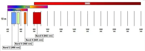
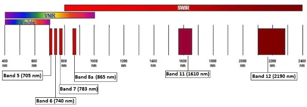
In particular, we will consider:
- Band 2, 3, and 4 at 10m to generate the RGB image and combine the red band for a spectral index.
- Band 8 at 10m and band 8a at 20m for the near infrared (NIR).
- Band 12 at 20m for the shortwave infrared (SWIR).
In the 20m spatial resolution we are using the SWIR at band 12 and not 11 because it should be better correlated with the burn severity measure.
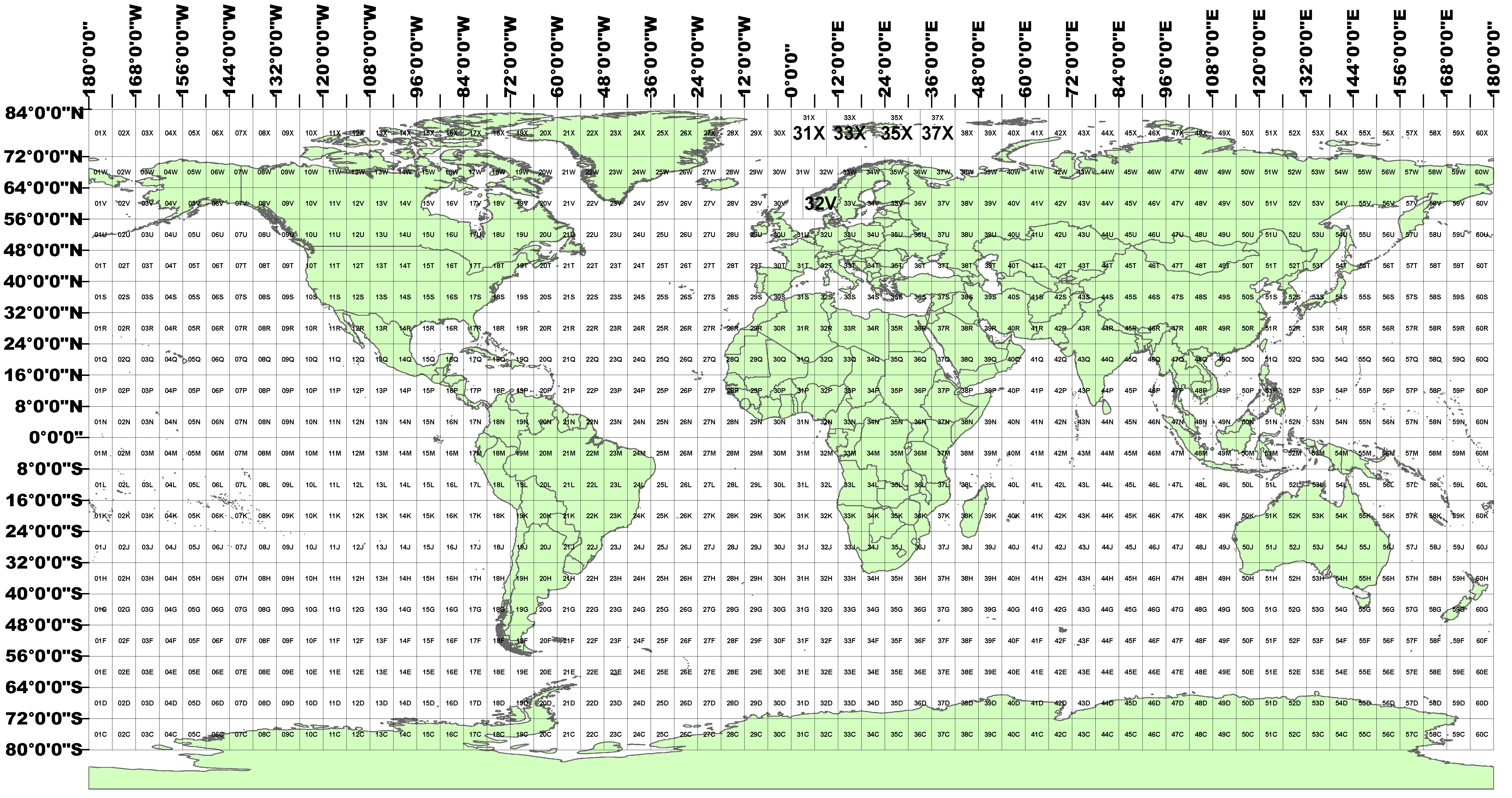
What we are interested in from the products offered for the Sentinel-2 is called granule, or also commonly referred to as tile. A tile is a snapshot for all the spectral bands with a spatial dimension of . These tiles are represented using the Universal Transversal Mercator (UTM) reference system to project geographic coordinates in the sphere to a plane reference system where we can compute distances. Within this system, the Earth’s surface is divided into different regions that can be identified with an ID as visible in the picture below:
Download data from Copernicus
The most direct approach to get Sentinel-2 data is through the Copernicus browser. If you are new to EO like me, it will not be very intuitive how to use the website, but I do believe it is very informative and useful to play around with the manual download of the data before leveraging their API. If you like, you can also understand how to use the Copernicus Browser by watching the videos shared on their YouTube channel.
The tile I selected is associated with the identifier:
S2A_MSIL2A_20260409T101051_N0512_R022_T33UVU_20260409T170912
You can copy paste this string into the Search Criteria and then press Search to view the scene associated with it.
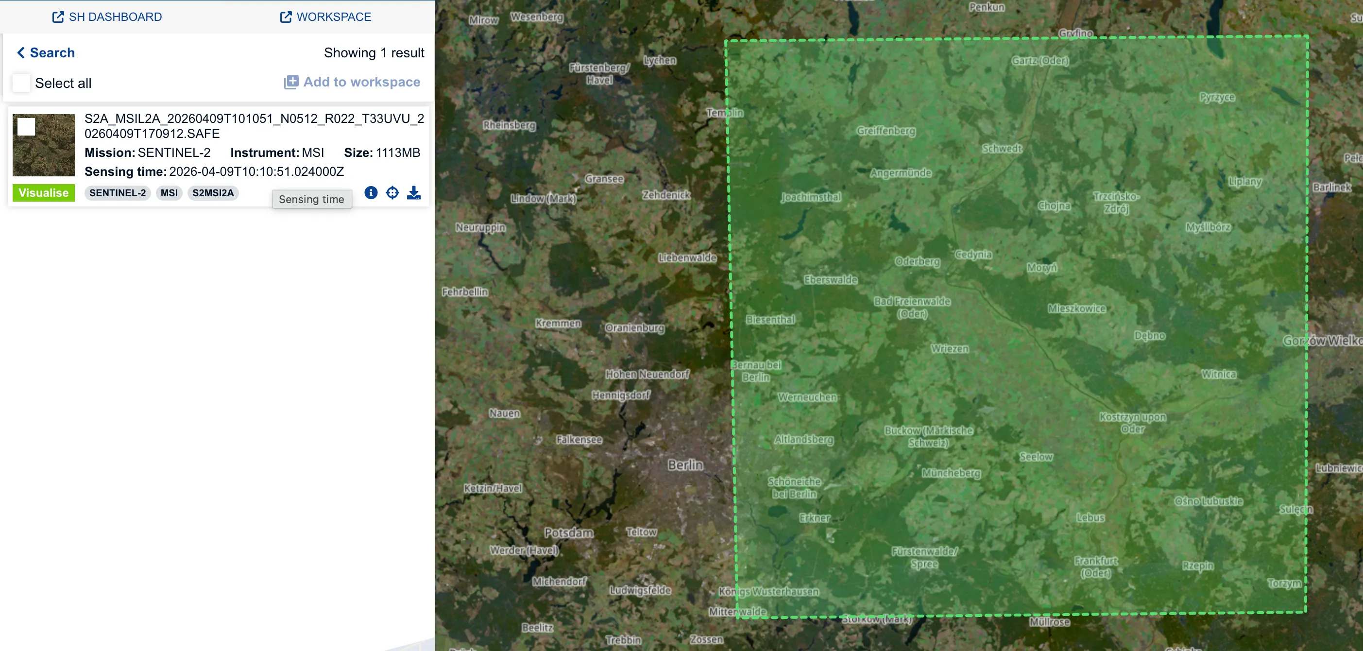
If you are interested in understanding what this ID means, please refer to the
S2 products web page, but in simple terms, it is nothing but a unique
identifier in space, time, and boundary conditions for a tile. In particular,
the part T33UVU indicates the specific tile identifier, and you can find its
position in the tiling system picture by looking for the 33UVU rectangle.
When dealing with satellite imagery, product is the term associated with data at a specific level of post-processing. In our case, we will use the 2A product because it provides images with atmospheric correction already applied, the so called Bottom of Atmosphere (BOA) version. Images at Top of Atmosphere (TOA) are provided with the 1C product, but contain more noise that we would have to manually clear.
From the left side you download the zip file containing all the data associated
with this scene. Unzipping the file will give you a .SAFE folder, which stands
for Standard Archive Format for Europe. You can then find all the band images
represented with the .jp2 format which is the newer standard for the old
.jpg, designed specifically to support georeferencing data.
A better alternative for downloading data, as already mentioned, is via API. In
this context, the industry matured, creating a common standard to store and
provide geospatial information, the SpatioTemporal Asset Catalog (STAC).
Within STAC, we refer to a specific asset, like a band, as an Item which is
stored in the standard GeoJSON format.
Spectral indexes
We mentioned that the Red band data will be used to compute an index for the analysis, but what does this mean? When we have access to spectral data, we have the possibility to observe characteristics of the observed objects that are far beyond what we can see with our eyes. Spectral indexes are combinations of spectral bands designed to highlight specific objects or characteristics on the ground.
The normalized difference vegetation index
The Normalized Difference Vegetation Index (NDVI) is a metric used to quantify the health and density of vegetation using two electromagnetic bands:
- Red: is absorbed where there is a high level of chlorophyll.
- Near infrared (NIR): healthy vegetation is characterized by a high reflectance in this band.
The reason behind the composition of this index is that in healthy photosynthesizing plants, chlorophyll strongly reflects NIR light and absorbs most red light. When the health condition of the plants is reduced, they tend to absorb more NIR and reflect red. The formula is as follows:
So, in healthy vegetation we expect to see high absorption in the red band, and high emission in the NIR one, causing the NDVI to be close to 1. When the vegetation is not healthy, the opposite happens and the index moves towards -1, which is the lower bound of the index. More generally, the NDVI can be used to discriminate different surface types, categorized in the table below:
| NDVI | Object |
|---|---|
| < 0 | water bodies |
| ~ 0 | rocks, sands, concrete surfaces |
| > 0 | vegetation |
The normalized burn ratio
The Normalized Burn Ratio (NBR) is an index used to identify burned areas. This index is obtained using two EM bands:
- Near infrared (NIR): as we already know, healthy vegetation is characterized by a high reflectance in this band.
- Shortwave infrared (SWIR): healthy vegetation is characterized by a low reflectance in this band, while burned areas have a high reflectance percentage. The particularity of this radiation is that it is able to pass through smoke from fires.
The formula for the NBR is as follows:
Also in this case, the denominator allows us to normalize the values in the range . The NBR is used in a differential form to evaluate the severity of a wildfire by evaluating the delta between the NBR pre and post fire. This is particularly useful because it allows us to discriminate between recently burned area and bare ground, since both are associated with a low value of the NBR.
The dNBR index is particularly sensitive to the combination of location and between the two measurements. In locations like tropical areas, vegetation regrowth is particularly fast, and for this reason it is important to take a post fire snapshot not too far in time to have a measure that is not affected by post-fire new vegetation.
Based on the value of the dNBR, we can assess the severity using the severity classes designed by the United States Geological Survey (USGS):
| dNBR range | Severity class |
|---|---|
| High enhanced regrowth | |
| Low enhanced regrowth | |
| Unburned | |
| Low severity | |
| Moderate-low severity | |
| Moderate-high severity | |
| High severity |
The burn severity is a measure of how the fire intensity affected the functioning of the ecosystem in the area affected.
Methodology
We are now ready to start to investigate an approach based on the usage of the previously presented spectral indexes for the identification and assessment of wildfires. The methodology is divided into 3 steps:
- Acquisition and processing of vector data for municipalities boundaries, roads, and lands in the selected area.
- Acquisition and processing of the raster data from Sentinel-2 acquisitions.
- Wildfire segmentation and impact assessment combining vector and raster data. This step is followed by a validation of the procedure with the official Copernicus Emergency Management Service (CEMS) report.
In the next sections we will go into detail in each of the methodology steps. In doing so, the most important concepts will be presented and described with code snippets, but to keep the presentation digestible, most of the code will be skipped or simplified. Please, refer to the associated notebooks for the complete procedure.
Municipalities, roads, and lands
When we analyze a particular phenomenon like a wildfire, two important data we
need to manage are the municipalities or regions where the phenomenon
manifested, and the critical elements within these regions. This information is
shared in the GIS ecosystem as vector data. Vector data is one of the
primary data types to analyze values with associated geographic information
since it allows modelling geometric elements like Points, Lines, and
Polygons with their coordinates. We can for example represent a
specific location like a restaurant with a point, a road with a line, and a park
with the polygon surrounding it.
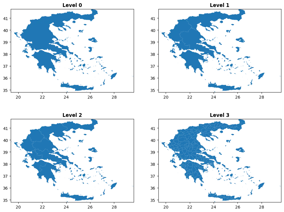
One of the common sources of geospatial vector data associated with municipalities is the Database of Global Administrative Areas GADM. Administrative areas are provided at different levels based on the details we need to analyze. From the GADM website, we can download the administrative areas for Greece in two of the most common formats Geopackage or Shapefiles. I personally prefer the former type since the latter is composed of many files containing different information that are all required to interpret the data, making harder the management of its content and more scattered the sources used. In both cases, we can use the GeoPandas package to analyse the data:
import geopandas as gpd
gpd.list_layers(<FILE_PATH>)
gdf = gpd.read_file(<FILE_PATH>, layer=<ADMIN_LAYER>)For this analysis we want to use information at municipality levels, so we will
work with data in the Level 3:
To understand which of the municipalities we want to retain for the analysis, we
can proceed in the following way. We can get from the CEMS report the
approximate values for the longitude and latitude of the wildfire center, and
then, we can explore the GeoDataFrame with the center information overlapped
in a visual map:
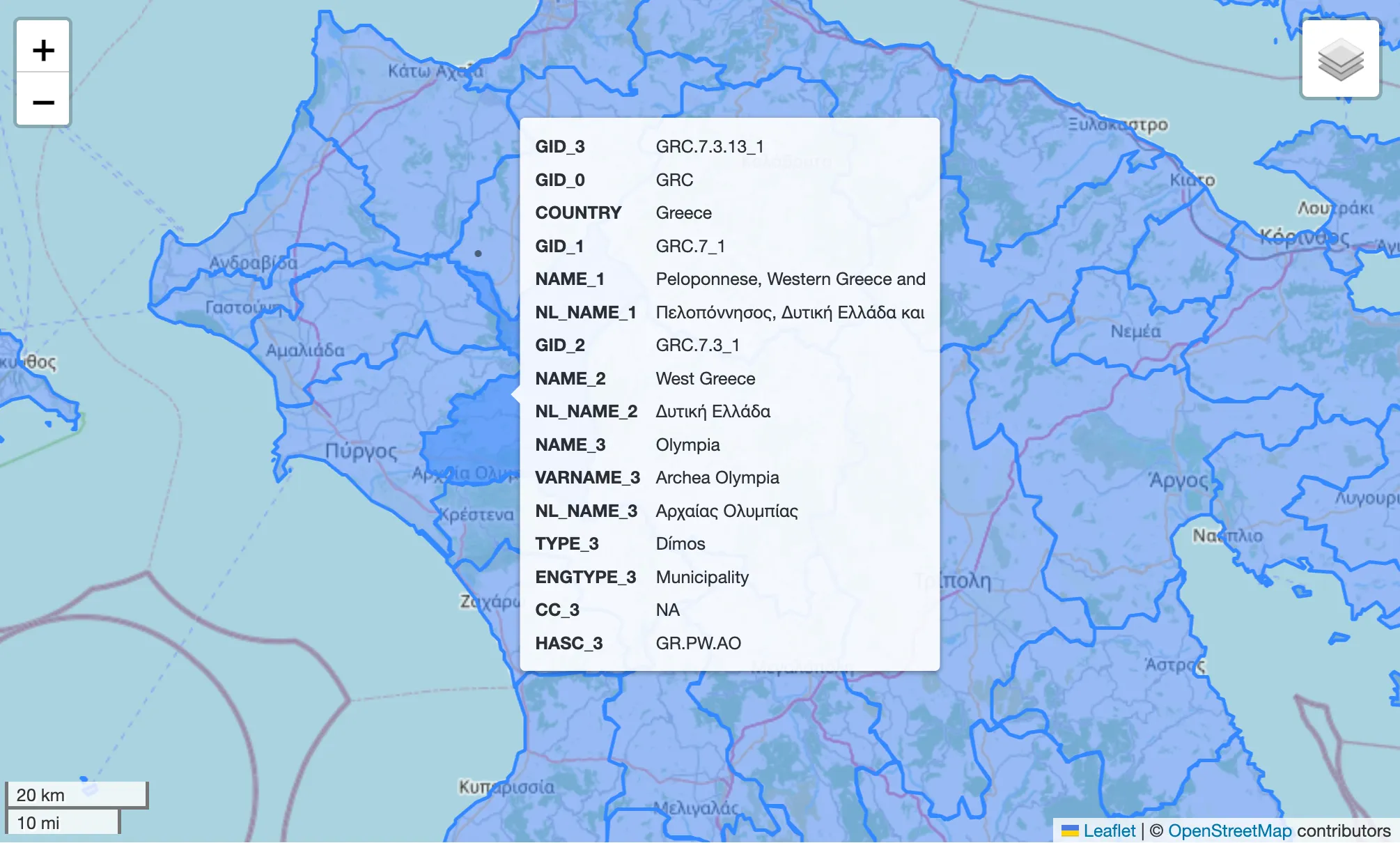
By using Folium we can
easily explore a GeoDataFrame by displaying the data information directly on a
visual map. In this case, we decided to keep the data associated with 4
municipalities: Erymanthos, Ilida, Dytiki Achaia, and Olympia. Now that we
have the boundaries, we can focus our attention on the elements that we want to
use in the analysis to identify what was damaged by the fire and in which
measure. To do so, we have to download data associated with roads, parks, or any
other element we want to study. This kind of information can be obtained from
OpenStreetMap (OSM), an open-source project that
provides geographic data such as street maps, and that is used in tools like
Garmin GPS to provide low level details of a particular geographic area. We can
obtain OSM data from
Geofabrik which provides
vectors for the entire Greece in a Geopackage file. The approach to get roads
vector for the previously selected municipalities is pretty simple, and will be
the same for all the other elements we want to analyze. We first import the data
and select the layer associated with the roads:
roads = gpd.read_file(<FILE_PATH>, layer=6)At this point, we have all the roads of Greece in roads, and the 4 selected
municipalities in a variable that we call aoi. What we have to do is just to
intersect the two datasets and keep only what intersects our area of interest,
right? Partially. The general approach is correct, but there is a gotcha. When
you describe the shape of a function, or an object, you can not just say, the
value of is . What are these , and ? To unequivocally identify
them, we need also to specify with respect to which point we are providing
information and measurements. This information in GIS is a bit complicated
because we work not only with points on a plane, but with points on a very
complex 3D shape like the one of the Earth. It’s not here the moment to dive
deeper into the different ways a point on the Earth is identified, but it is
very important to keep in mind that there are many ways to represent a location,
and when we compare two objects, we need to be sure that they are described
using the same Coordinate Reference System (CRS). We can get the CRS
information directly from the GeoDataFrame:
aoi.crsWhich for our municipalities returns:
<Geographic 2D CRS: EPSG:4326>
Name: WGS 84
Axis Info [ellipsoidal]:
- Lat[north]: Geodetic latitude (degree)
- Lon[east]: Geodetic longitude (degree)
Area of Use:
- name: World.
- bounds: (-180.0, -90.0, 180.0, 90.0)
Datum: World Geodetic System 1984 ensemble
- Ellipsoid: WGS 84
- Prime Meridian: GreenwichWe can also get the coordinates of the bounding box containing our geometry
with aoi.total_bounds, which will return the coordinates w.r.t. the associated
CRS. Now that we know what to be careful about, we can perform the intersection:
aoi_roads = gpd.clip(roads.to_crs(aoi.crs), aoi)Where we projected the roads into the area of interest CRS with the
to_crs() method. The GeoDataFrame contains many different kinds of roads,
but we are interested only in the principal ones, so we can filter the table to
only keep primary, secondary, and tertiary roads:
road_types = ["primary", "secondary", "tertiary"]
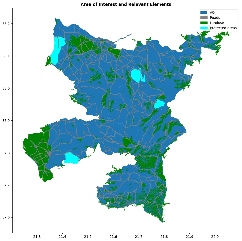
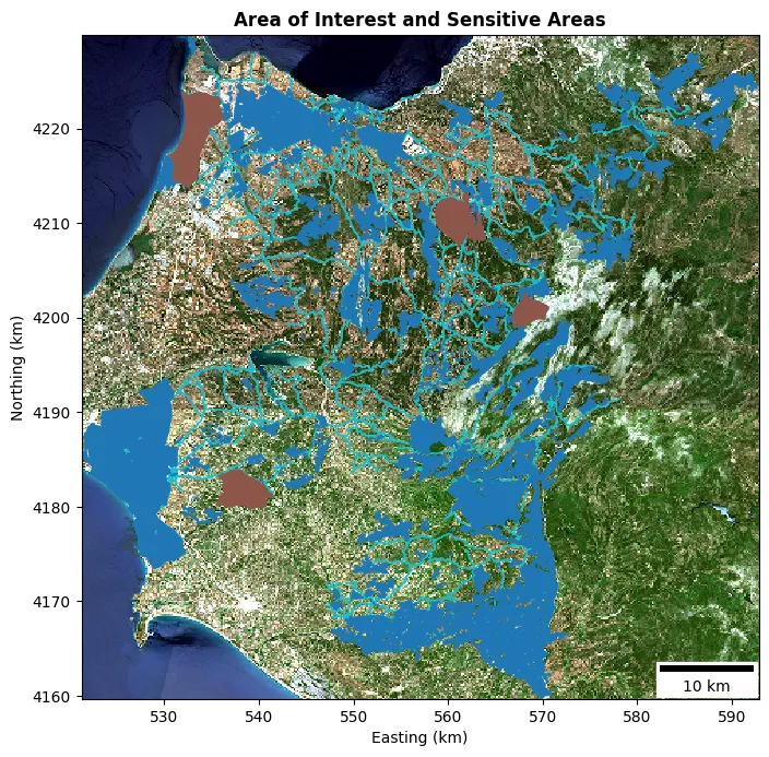
selected_roads = roads[roads["fclass"].isin(road_types)]We can repeat these operations to clip the other elements we want to analyze, in our case land use and protected areas. At the end of this step, we should have obtained the vector representing the area of interest plus all the relevant elements like in the image below:
One important consideration we should make here, is: when a fire breaks out, are only the precise points of the fire location that can be damaged, or the effects are propagated also to neighboring areas? If we consider a park for example, the effects of the fire on the trees are present even if the fire was not precisely inside the park. We can address this issue by inflating the elements geometry by creating a buffer around them. A buffer is just a way to enlarge the vector by extending its thickness by a specific amount. Since this operation requires us to work with specific distances, we cannot do it in whatever CRS we want, but we need to use one that correctly represents distances for the area we are investigating.

Yeah, this is probably the reaction you had while reading the last part. But don’t despair, the concept is not that complex and is associated with the shape of Earth, and how we measure distances on it. When we work with geographic coordinates, longitude and latitude, positions are represented with angles, and they are not good to measure distances. The reason is that the conversion from angles to meters is not constant over the latitude, since 1 degree close to the poles is not associated with the same meters of 1 degree close to the equator. For this reason, we need to be sure to work with a projected coordinate system that maintains correct distances in the area we are working with. The correctness of the distances measured depends on how the process of going from a sphere to a Cartesian reference system is done. Since this process always involves some approximation, we will have multiple CRS, each one precise only in a specific region. This context is not exhaustive at all, but should be enough to understand how to buffer a shape:
def apply_buffer(data, crs, buffer):
data = data.copy()
original_crs = data.crs
data["geometry"] = data.to_crs(crs).buffer(buffer).to_crs(original_crs)
return dataIn our specific case, in the function, we project each vector into the local CRS
identified by the code EPSG:32634. Now, we have all
that we need to move to step two, so we can combine all the data in a single
GeoDataFrame and store it into disk:
aoi_and_elements.to_file(generated_dir / "aoi.gpkg")Let’s get raster
In this step, we will retrieve the spectral information for the area of interest to analyze the pre and post fire conditions and identify the specific area that was affected by the wildfire. The spectral data is represented using multi-dimensional arrays which take the name of rasters. So the two most common GIS data types are geospatial vectors for 1-Dimensional data, and rasters for N-dimensional ones. A raster can be defined by two dimensions when the data is associated with a single quantity, and each element in the array is a specific pixel, or we can have three dimensions when the raster contains information for different measures on the same pixel. For example, an RGB image can be represented with a raster, where we have in the first dimension the values of the 3 spectral bands associated with the red, green, and blue for each pixel. A combination of multiple bands in a specific location and time is called a scene. What we need now, is to retrieve one scene pre fire and one scene post fire, so we can perform the differential analysis of the spectral responses of the terrain.
The STAC catalog for the Sentinel-2 data is stored into an S3-like bucket
managed by Copernicus and accessible at the host
eodata.dataspace.copernicus.eu. To connect with this host, we use a client
capable of interacting with the STAC API, which for Python is the
pystac_client. In
the notebook we use a thin wrapper class around the client:
client = SentinelStacClient(url)For the pre and post fire scenes we used the same dates used in a paper that analyzed the same wildfire:
| Pre-fire date | Post-fire date |
|---|---|
| 16 June 2024 | 26 June 2024 |
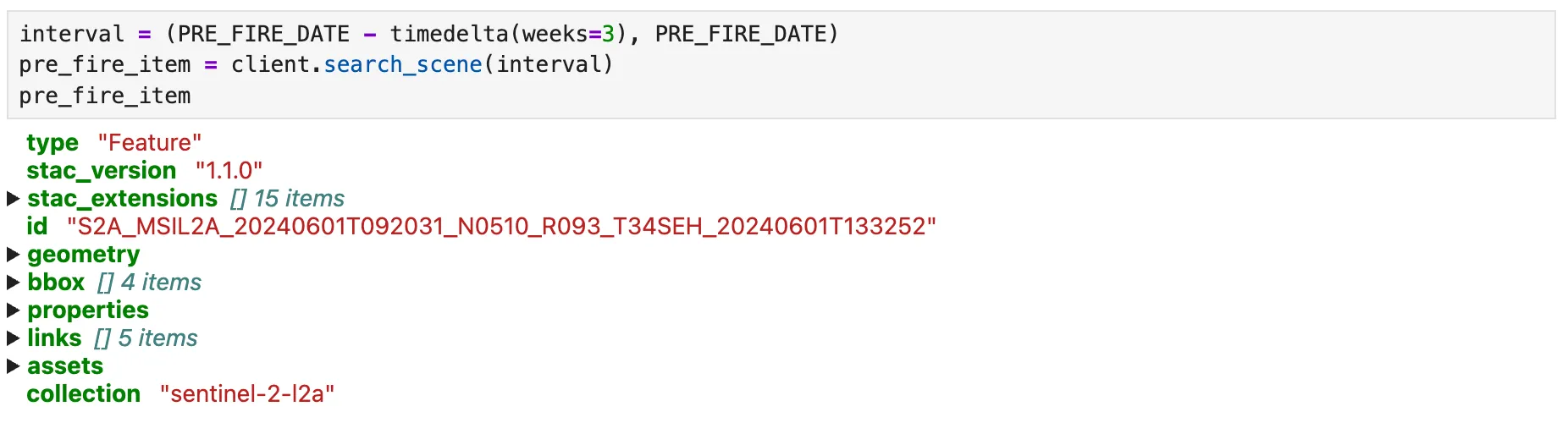
At this point, we can query the catalog to get an item that satisfies our constraints. During the search we specify the desired time interval, the bounding box, and the max cloud coverage. This last filter is very important since clouds do not permit sensing the spectral response of the surface beneath them, so pixels that are covered by clouds must be considered as noise. Below is reported an example of the GeoJSON information associated with a STAC item for the pre fire date.
At this point, we didn’t actually get the tile with band information. What the
catalog is designed to do in STAC spec, is just to provide an href we can then
follow to download the data we want. Here is another important aspect, even
though we can access it to query information via the API, to download the data
we need to set the environment variables that will be used during the
authentication. You can get your access token from the Copernicus browser
webpage for free, and the variables can be loaded in the context with:
os.environ["AWS_S3_ENDPOINT"] = "eodata.dataspace.copernicus.eu"
os.environ["AWS_VIRTUAL_HOSTING"] = "FALSE"
os.environ["AWS_ACCESS_KEY_ID"] = os.getenv("ACCESS_KEY")
os.environ["AWS_SECRET_ACCESS_KEY"] = os.getenv("SECRET_KEY")The virtual hosting flag is needed to properly resolve the href path which for Copernicus does not follow the classic s3 structure. We just need to load the env variables into scope because by using rasterio the authentication phase is managed automatically.
pre_fire = client.search_scene(interval)
with rasterio.open(pre_fire.assets["B04_10m"].href) as src:
raster = src.read()Rasterio is a Python library that binds with the Geospatial Data Abstraction Library (GDAL) used in GIS to read the standard format commonly used for geospatial applications called GeoTIFF, and to create handy numpy arrays out of them. GeoTIFF stands for Geographic Tagged Image File Format and defines the requirements and how to encode images along with geographic information. In GIS, however, it is common to not work directly with Numpy arrays but to use one of their extensions called xarray. We can easily work with xarrays by using a rasterio wrapper called rioxarray.
To get the data associated with the bounding box containing our AOI vector created in the previous step, we had to download rasters associated with two tiles, the 34SEG and the 34SEH. The procedure to combine data from rasters of different locations is called mosaic operation. A visual RGB image of the tiles is reported below:
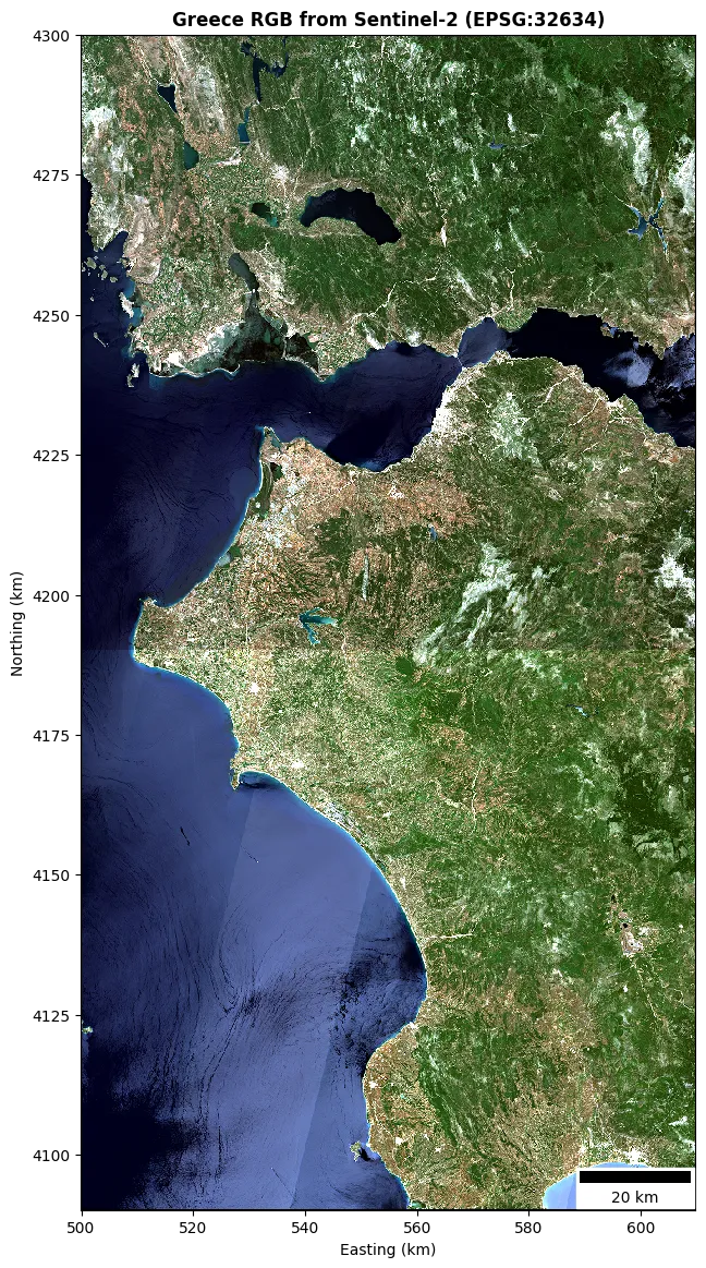
From the image we can observe two interesting things:
- Tile shadow: Since the two tiles have been generated in two different moments they have slightly different conditions. Moreover, I normalized the data before creating the mosaic…
- Satellite swath: The trajectory followed by the satellite in the acquisition is pretty visible by the swath fingerprint, the diagonal stripe crossing the image.
We can also cut the mosaic to the precise bounding box associated with the vectors data:
aoi_box = aoi_and_elements.to_crs(mosaic.rio.crs).total_bounds
mosaic_clip = mosaic.rio.clip_box(*aoi_box)Where .rio allows us to access the rasterio methods directly on the
xarray.DataArray of the mosaic. By plotting the clipped mosaic and the
elements in the AOI we obtain:
Let’s now create the mosaic of the bands we concretely use for the differential
NBR analysis: B8A_20m and B12_20m. The Copernicus database stores the values
of these bands not directly as reflectance, but on a scaled version called
Digital Number (DN). The conversion from DN to BOA reflectance is:
Where the scale and offset values can be obtained in the bands metadata:
raster:scale 0.0001
raster:offset -0.1The greyscale visualization of the two bands for the two retrieved scenes is:
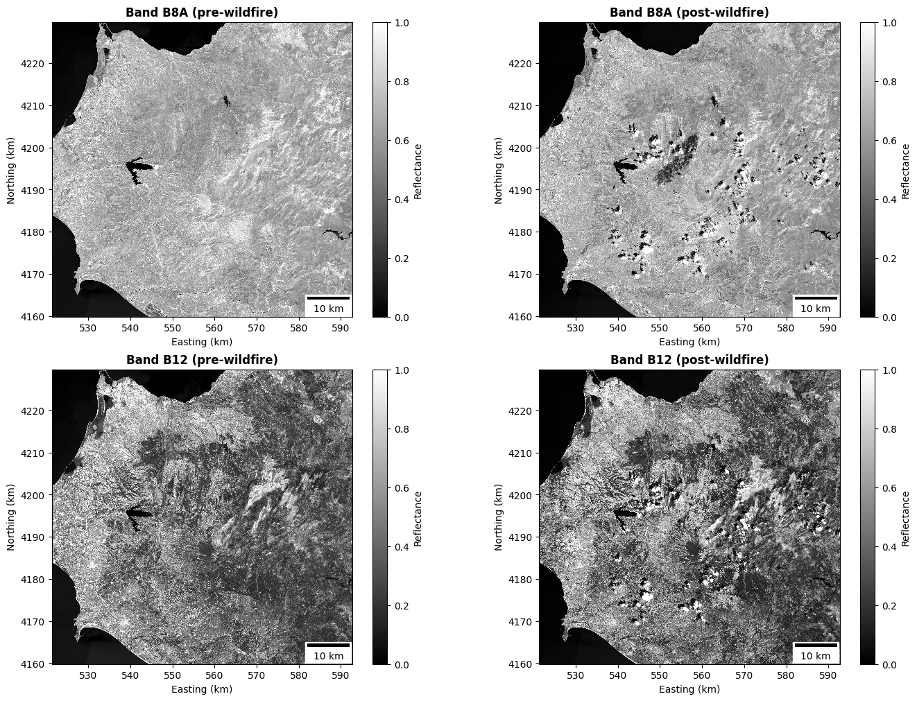
From the picture we can see that the water is absorbing in both the frequency bands, while clouds, visibly present only on the post fire image, have the opposite behavior. It is also possible to see a black region in the band B8A, which is exactly where the wildfire happened. This is because damaged vegetation absorbs in the NIR instead of reflecting like the healthy one. To better highlight the burn scar, we should find a way to push the pixel values of that region to one of the boundaries of our color scale. Now for example, we see that the water is way darker than the scar. We can achieve this goal by using a false color image composed of the bands associated with the SWIR, NIR, and Green, obtaining an image that allows the burned scar to nicely stand out thanks to the high reflectance of old ash:
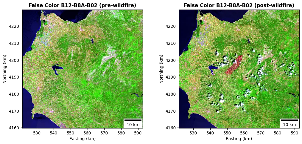
As we saw from the previous image, the post scene is contaminated by a lot of clouds. Clouds and water are elements that are not important for the wildfire assessment and are known to cause issues with the dNBR calculation. We can mask out pixels associated with these surfaces by using the Scene Classification Layer (SCL) provided along with the other spectral bands. This raster contains categorical values classifying the pixels into one of the 12 used classes:
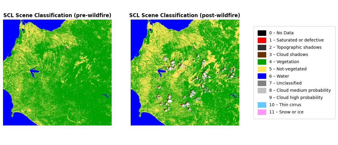
Our mask will be used to remove pixels associated with nodata, saturated or defective, dark/topographic shadow, cloud shadow, water, unclassified cloud medium probability, cloud high probability, thin cirrus, snow or ice:
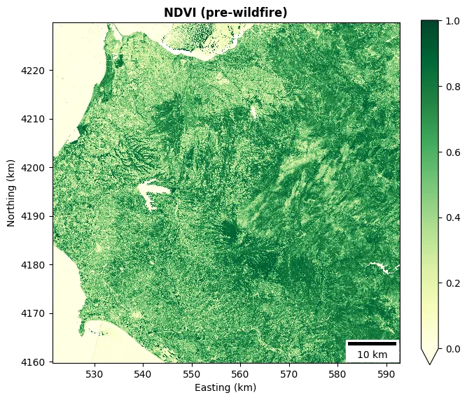
mosaic_scl_mask = mosaic_scl_pre.isin(bad_pixels) | mosaic_scl_post.isin(bad_pixels)Another raster that we will use in the wildfire analysis is the one containing the NDVI data for the AOI. We will use this raster to filter out pixels that are not associated with vegetation to reduce possible false positives:
Wildfire segmentation and classification
This is the last part of the methodology, in which all the data generated in the previous step is used to algorithmically segment the burn scar and to assess its impact on the underlying surface. As a first action, we compute the NBR for both the pre and post fire scenes:
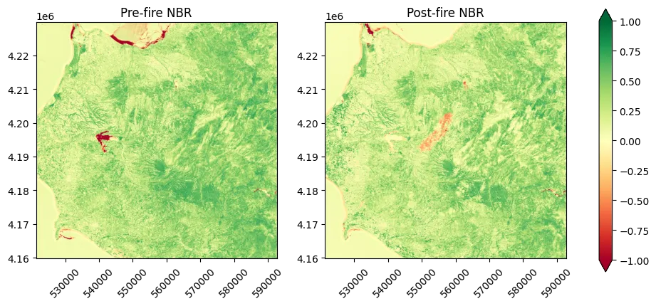
What we can observe from the two NBR plots, is that in the post fire scene, the burn scar appears as a region of pixels with negative values. However, it is also evident how the water region can cause confusion in the interpretation of the data. From the pre to the post scene, we have regions associated with water that went from negative values to positive and others that did the opposite. The other issue with the plain NBR, is that there is no cross information between the two scenes, and the indexes are computed without any reference to two different instants in time. For this reason, and to mitigate the water effect, the differential NBR is a better quantity to use. Before visualizing the data, we can classify each pixel of the dNBR raster by using the USGS classification table. In doing so, we will also apply the SCL mask to the raster to remove known false positives and cloud noise:
dnbr_masked = np.where(scl_mask.squeeze() == 0, dnbr, np.nan)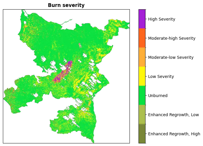
Nice! Our dNBR raster combined with the SCL map allowed us to create an image in which the burned scar is clearly associated with an organic cluster of high level severity pixels. Despite that, we can see that not only the scar is associated with burned classes, there are a lot of less organic regions where burned pixels are scattered with the classic salt-and-pepper pattern, and other regions where there are uniform low severity regions. This behavior is expected given that dNBR is also sensitive to other factors that have not been masked out. For example, there is no way for the index to discriminate between agricultural lands that have been harvested or burned area. If we create an RGB image where all burned pixels are assigned to the red value, the situation appears even more evident:
burned = dnbr >= 0.1
masked_rgb = xr.zeros_like(mosaic_visual)
masked_rgb[0] = mosaic_visual[0].where(~burned, 1)
masked_rgb[1:3] = mosaic_visual[1:3].where(~burned, 0)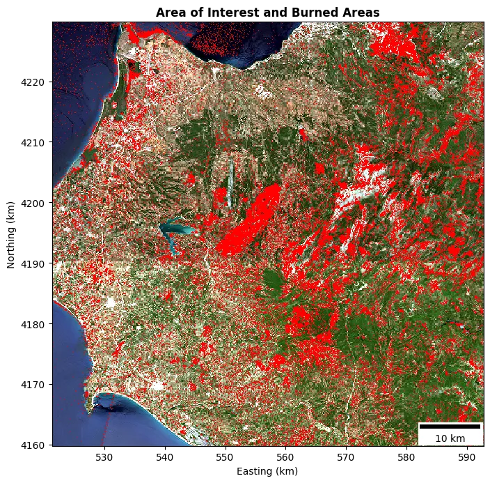
The image displays the entire area of interest with burned pixels without any mask applied, so that also the false positives associated with water can be appreciated. To improve the segmentation, we could use other datasets like CORINE with more specific classes to remove all the regions that cannot be associated with the wildfire, but I do believe it is more fun trying to automatically segment the image without too much help from external sources!
The post-processing phase we will follow is composed of the following steps:
- SCL mask application to remove measurement noise.
- Pre scene NDVI mask, which is used to filter out non-vegetated pixels which differential value would be meaningless.
- A sieve filter.
The sieve filter is an approach that consists in collapsing all the regions that have a connected area lower than a Minimum Mapping Unit (MMU). This is a classic post-processing filter applied when analyzing geospatial images. However, as we can see from the next image, despite the application of these filters, it is almost impossible to completely remove some of the false positives.
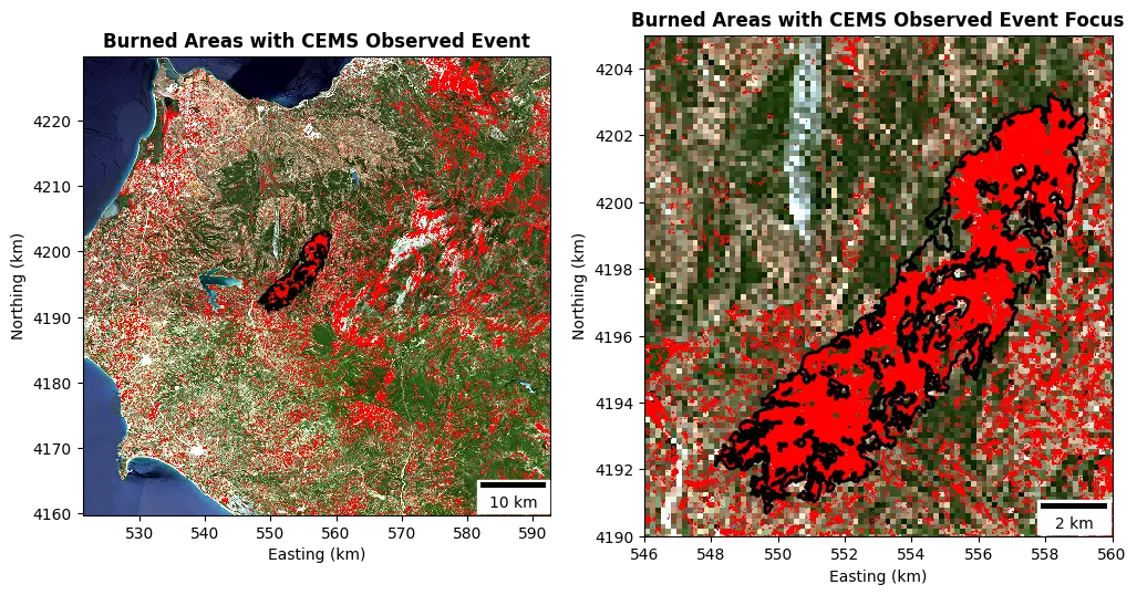
But don’t despair, this is completely fine since our dNBR index is pretty dumb, it just checks where a pixel had a specific variation in reflectance, and this variation can be caused by many reasons. The soundness of the analysis is reinforced by the following observations:
- The mean of the dNBR index across the entire raster is ALMOST zero.
- The USGS classification has been designed for regions with characteristics different from European landscapes.
- The burned area is the most homogeneous connected area in the image.
Another important observation is that the differential index is based on two scenes collected at different dates. The best case would be to acquire one image right after the ignition of the fire, and one after. In our case, the two scenes used are pretty far in time, and this introduced in the analysis a temporal bias that could have introduced a seasonal change in the vegetation health. So, despite close to zero, we could improve the analysis by removing the average dNBR from all the pixels in the attempt to obtain a more robust analysis.
Despite this, let’s not lose heart and see if we can still achieve our goal. The next step is to algorithmically create a segmentation for the scar. The approach we will use is pretty simple: we create shapes out of raster features, and then we keep the shape with the highest area. A feature is considered as a connected region with a common feature, in this case if it is a burned pixel or not. After this operation, we can see that we clearly segmented the burned area without any additional information out of the dNBR values:
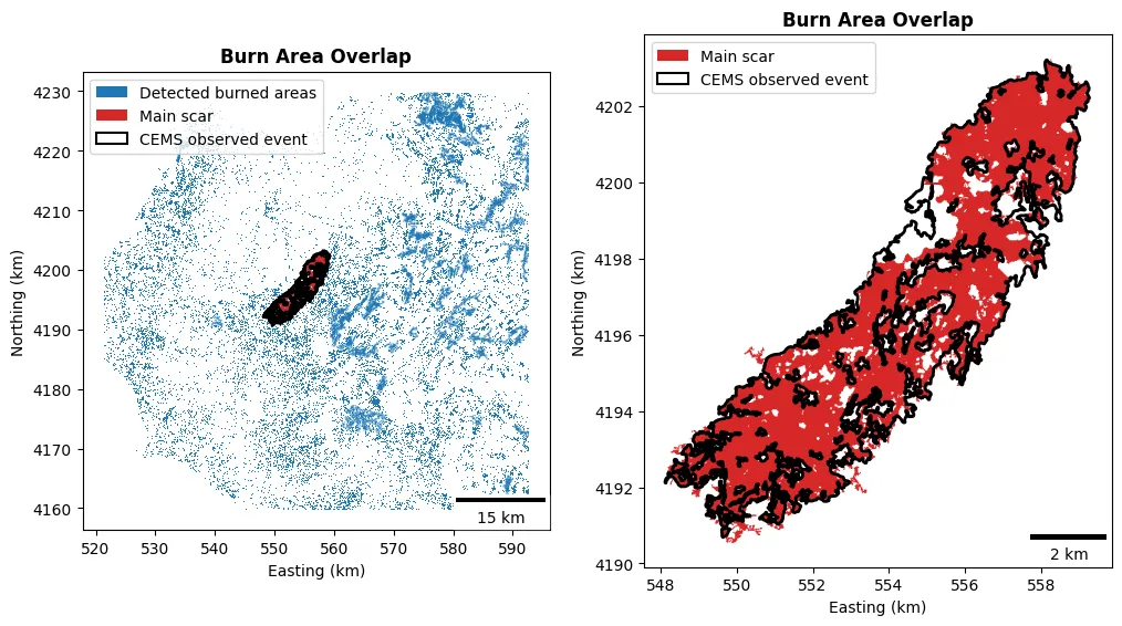
In blue we can see all the detected burned points, in the red the segmented scar, and in black the perimeter of the wildfire segmented by CEMS. We should be satisfied enough noticing that our segmentation is very close to the CEMS one, except in the region that was covered by clouds, an issue that can be easily solved by using a scene from another day.
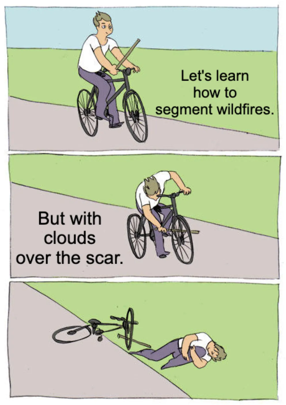
Despite that self-sabotage of the analysis, we obtained a result pretty close to the reference in terms of segmented area as visible in the next table.
| CEMS | stepit | |
|---|---|---|
| Burned area | 38.66 | 38.89 |
A more fair comparison can be obtained by evaluating classic computer vision metrics which take into account not only the overall areas, but even statistical elements:
- Precision: fraction of the detected area lying inside the reference (how much of what we mapped was really burned).
- Recall: fraction of the reference area that we detected (how much of the real scar we captured).
- Intersection over Union (IoU): a single score combining both.
| Precision | Recall | IoU |
|---|---|---|
| 0.87 | 0.86 | 0.76 |
Acceptable values of IoU are typically above , with results considered very good the values are is above . We can now visualize the USGS burn severity level inside our scar polygon and the associated classes distribution:
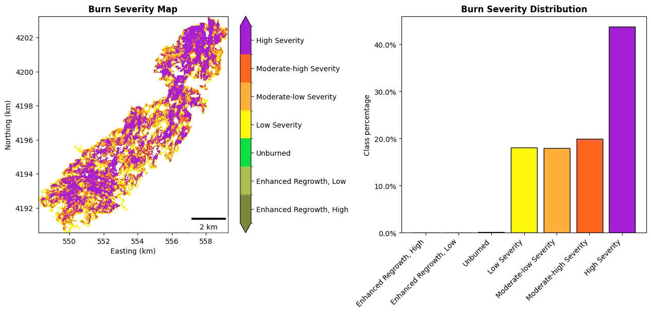
The result that the majority of the pixels have been classified as high severity is coherent with the fact that this has been one of the most severe wildfires in Greece’s entire history. The paper from Castro et. al. obtained quite different results in the classification, but in doing the assessment, they used a slight variation of the dNBR index but still used the USGS classes designed for the dNBR. Indeed, they never obtained high severity pixels in all the analysis performed.
As a concluding step, we can evaluate which and in which measure, the selected critical elements have been impacted.
| Element | Absolute Value | % of Segmented Scar |
|---|---|---|
| Roads | 4.82 | 12.4 |
| Protected areas | 0 | 0 |
| Natural land use | 33.57 | 86.3 |
The majority of the impacted area was covered by lands, with a burned extent of around . The wildfire also impacted national infrastructures since around of roads were located in the scar area, but fortunately, no protected areas have been destroyed.
Conclusion
Let’s wrap up what we did and what we learned in this first post about EO analysis. We touched a bit on how remote sensing is performed and what electromagnetic bands are. We discovered that bands are used to generate rasters from which scientists can understand the status of the Earth’s surface by analyzing the responses at various frequencies.
With a basic understanding of the context, we moved into the data part, and understood how to gather and manipulate the data directly from satellite observations. We used the data associated with multiple bands like the NIR, Red, and SWIR to compute the spectral indexes and identify an area affected by a wildfire in Greece. In doing so, we worked with all the most commonly used GIS libraries and data types. From the dNBR, we then automatically segmented the scar after a post-processing phase to remove noise and false positives. The wildfire has then been classified by using USGS severity classes and validated against the report created by CEMS, obtaining good results in terms of identified area and statistical metrics.
This was a nice journey into the classic techniques used in wildfire monitoring and assessment. In the next posts, we will investigate other applications of satellite imagery and more advanced techniques based on machine learning and deep learning. I hope you enjoyed the reading, and see you in the next article!
References
- Work with the Difference Normalized Burn Index - Using Spectral Remote Sensing to Understand the Impacts of Fire on the Landscape
- Wildfires During Early Summer in Greece (2024): Burn Severity and Land Use Dynamics Through Sentinel-2 Data
- Newcomers Earth Observation Guide
- What is SWIR? Short-wave infrared data, explained
- Normalized Burn Ratio (NBR)
- Tiling system
- Introduction to Geospatial Raster and Vector Data with Python
- FANG - Fire Applications with Next-Generation Satellites
Footnotes
-
Well, maybe you already know how to do it, but this will be my goal for the next months! ↩